
CSSで図形
こんにちは、ビースマイル東中島のYです。
今回は色々な図形をCSSで描いてみたいと思います。
使用頻度が高くよく検索する三角形を中心にメモのつもりで残したいと思います。
Square:正方形
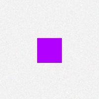
#square {
width:50px;
height:50px;
background:#B200FF;
}
Rectangle:長方形
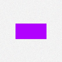
#rectangle {
width:100px;
height:50px;
background:#B200FF;
}
Circle:円形
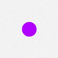
#circle {
width:50px;
height:50px;
background:#B200FF;
-moz-border-radius: 25px;
-webkit-border-radius: 25px;
border-radius: 25px; /* 横幅&高さの1/2 */
}
Oval:楕円形
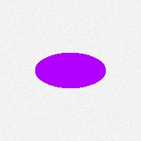
#oval {
width:100px;
height:50px;
background:#B200FF;
-moz-border-radius: 50px / 25px; /* 高さ÷2 */
-webkit-border-radius: 50px / 25px;
border-radius: 50px / 25px;
}
Triangle Up:三角形(上)
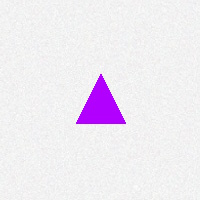
#triangle-up {
width: 0;
height: 0;
border-left: 25px solid transparent;
border-right: 25px solid transparent;
border-bottom: 50px solid #B200FF;
}
Triangle Down:三角形(下)
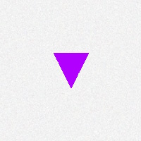
#triangle-down {
width: 0;
height: 0;
border-left: 25px solid transparent;
border-right: 25px solid transparent;
border-top: 50px solid #B200FF;
}
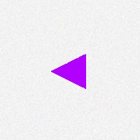
Triangle Right:三角形(右)
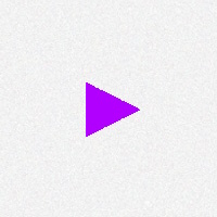
#triangle-right {
width: 0;
height: 0;
border-top: 25px solid transparent;
border-bottom: 25px solid transparent;
border-left: 50px solid #B200FF;
}
Triangle Left:三角形(左)
#triangle-left {
width: 0;
height: 0;
border-top: 25px solid transparent;
border-bottom: 25px solid transparent;
border-right: 50px solid #B200FF;
}
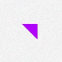
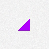
Triangle TopLeft:三角形(左上)
#triangle-topleft {
width: 0;
height: 0;
border-right: 50px solid transparent;
border-top: 50px solid #B200FF;
}
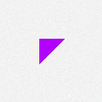
Triangle Topright:三角形(右上)
#triangle-topright {
width: 0;
height: 0;
border-left: 50px solid transparent;
border-top: 50px solid #B200FF;
}
Triangle BottomLeft:三角形(左下)
#triangle-bottomleft {
width: 0;
height: 0;
border-right: 50px solid transparent;
border-bottom: 50px solid #B200FF;
}
Triangle Bottomright:三角形(右下)
#triangle-bottomright {
width: 0;
height: 0;
border-right: 50px solid transparent;
border-bottom: 50px solid #B200FF;
}
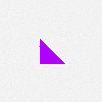
Trapezoid:台形
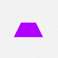
#trapezoid {
height: 0;
width: 50px;
border-bottom: 50px solid #B200FF;
border-left: 25px solid transparent;
border-right: 25px solid transparent;
}
Parallelogram-:平行四辺形
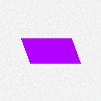
#parallelogram {
width: 100px;
height: 50px;
-webkit-transform: skew(20deg);
-moz-transform: skew(20deg);
-o-transform: skew(20deg);
background: #B200FF;
}
PacMan:パックマン型
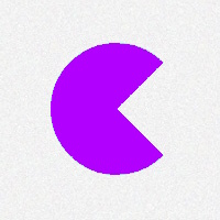
#pacman {
width: 0px;
height: 0px;
border-right: 60px solid transparent;
border-top: 60px solid #B200FF;
border-left: 60px solid #B200FF;
border-bottom: 60px solid #B200FF;
border-top-left-radius: 60px;
border-top-right-radius: 60px;
border-bottom-left-radius: 60px;
border-bottom-right-radius: 60px;
}
Moon:月

#moon {
width: 80px;
height: 80px;
border-radius: 50%;
box-shadow: 15px 15px 0 0 #B200FF;
}
Egg:卵型
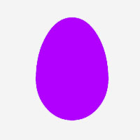
#egg {
display:block;
width: 126px;
height: 180px;
background-color: #B200FF;
-webkit-border-radius: 63px 63px 63px 63px / 108px 108px 72px 72px;
border-radius: 50% 50% 50% 50% / 60% 60% 40% 40%;
}
Pentagon:ペンタゴン
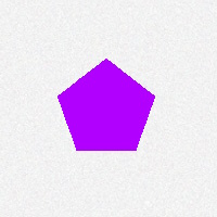
#pentagon {
position: relative;
width: 54px
border-width: 50px 18px 0;
border-style: solid;
border-color: #B200FF transparent;
}
#pentagon:before {
content: “”;
position: absolute;
height: 0;
width: 0;
top: -85px;
left: -18px;
border-width: 0 45px 35px;
border-style: solid;
border-color: transparent transparent #B200FF;
}
Hexagon:ヘキサゴン
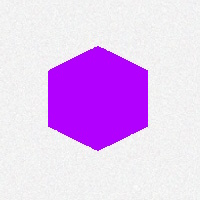
#hexagon {
width: 100px;
height: 55px;
background: #B200FF;
position: relative;
}
#hexagon:before {
content: “”;
position: absolute;
top: -25px;
left: 0;
width: 0;
height: 0;
border-left: 50px solid transparent;
border-right: 50px solid transparent;
border-bottom: 25px solid #B200FF;
}
#hexagon:after {
content: “”;
position: absolute;
bottom: -25px;
left: 0;
width: 0;
height: 0;
border-left: 50px solid transparent;
border-right: 50px solid transparent;
border-top: 25px solid #B200FF;
}
Octagon:オクタゴン
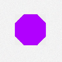
#octagon {
width: 100px;
height: 100px;
background: #B200FF;
position: relative;
}
#octagon:before {
content: “”;
position: absolute;
top: 0;
left: 0;
border-bottom: 29px solid #B200FF;
border-left: 29px solid #eee;
border-right: 29px solid #eee;
width: 42px;
height: 0;
}
#octagon:after {
content: “”;
position: absolute;
bottom: 0;
left: 0;
border-top: 29px solid #B200FF;
border-left: 29px solid #eee;
border-right: 29px solid #eee;
width: 42px;
height: 0;
}
Infinity:無限大
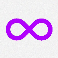
#infinity {
position: relative;
width: 212px;
height: 100px;
}
#infinity:before、#infinity:after {
content: “”;
position: absolute;
top: 0;
left: 0;
width: 60px;
height: 60px;
border: 20px solid #B200FF;
-moz-border-radius: 50px 50px 0 50px;
border-radius: 50px 50px 0 50px;
-webkit-transform: rotate(-45deg);
-moz-transform: rotate(-45deg);
-ms-transform: rotate(-45deg);
-o-transform: rotate(-45deg);
transform: rotate(-45deg);
}
#infinity:after {
left: auto;
right: 0;
-moz-border-radius: 50px 50px 50px 0;
border-radius: 50px 50px 50px 0;
-webkit-transform: rotate(45deg);
-moz-transform: rotate(45deg);
-ms-transform: rotate(45deg);
-o-transform: rotate(45deg);
transform: rotate(45deg);
}
5points:星型
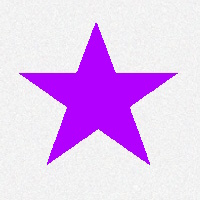
#star-five {
margin: 50px 0;
position: relative;
display: block;
color: #B200FF;
width: 0px;
height: 0px;
border-right: 100px solid transparent;
border-bottom: 70px solid #B200FF;
border-left: 100px solid transparent;
-moz-transform: rotate(35deg);
-webkit-transform: rotate(35deg)
-ms-transform: rotate(35deg);
-o-transform: rotate(35deg);
}
#star-five:before {
border-bottom: 80px solid #B200FF;
border-left: 30px solid transparent;
border-right: 30px solid transparent;
position: absolute;
height: 0;
width: 0;
top: -45px;
left: -65px;
display: block;
content: ”;
-webkit-transform: rotate(-35deg);
-moz-transform: rotate(-35deg);
-ms-transform: rotate(-35deg);
-o-transform: rotate(-35deg);
}
#star-five:after {
position: absolute;
display: block;
color: #B200FF;
top: 3px;
left: -105px;
width: 0px;
height: 0px;
border-right: 100px solid transparent;
border-bottom: 70px solid #B200FF;
border-left: 100px solid transparent;
-webkit-transform: rotate(-70deg);
-moz-transform: rotate(-70deg);
-ms-transform: rotate(-70deg);
-o-transform: rotate(-70deg);
content: ”;
}
6points:星型
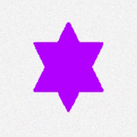
#star-six {
width: 0;
height: 0;
border-left: 50px solid transparent;
border-right: 50px solid transparent;
border-bottom: 100px solid #B200FF;
position: relative;
}
#star-six:after {
width: 0;
height: 0;
border-left: 50px solid transparent;
border-right: 50px solid transparent;
border-top: 100px solid #B200FF;
position: absolute;
content: “”;
top: 30px;
left: -50px;
}
The Shapes of CSS こちらのサイトを参考にしました。
BeSmile東中島は、大阪市東淀川区にある就労継続支援A型事業所です。
ホームページ、イラスト、手作り雑貨、音楽制作をしています。ご興味のある方はお問い合わせください。
